

Imagine walking into a high-end retail store. The lights are flickering, the aisles are blocked by empty cardboard boxes, the price tags are mismatched, and you have to walk through the stockroom just to find the exit. Would you buy anything? Probably not. You would turn around and walk out within seconds. Yet, this is exactly what thousands of businesses do to their digital visitors every single day. They invest heavily in driving traffic—through ads, social media, and email campaigns—only to funnel that expensive traffic into a broken, confusing, or outdated website layout. The harsh reality of the digital economy is this: Bad design does not just look unprofessional; it actively repels revenue.
When a user lands on your page, they make subconscious judgements about your credibility within 50 milliseconds. If your layout is cluttered, your navigation is illogical, or your call-to-action is buried beneath a mountain of irrelevant text, the user’s brain registers friction. And friction kills conversions. This blog is not about making your website “pretty”. It is about deconstructing the architectural failures that are draining your bottom line. We will dissect the technical anatomy of UI/UX, explore why functionality without design is futile, and guide you toward the solutions that actually work—including where to find the best partners to salvage your digital presence.
What is website design? (Beyond the Pixels)
To a fresher, website design might seem like the process of picking nice colors and arranging images. To a seasoned CTO, it is far more complex. However, let us strip away the jargon and define it clearly: Website design is the strategic arrangement of digital elements to facilitate a specific user goal. It is not art for art’s sake; it is visual engineering.
At its core, website design bridges the gap between the business objective (making a sale, capturing a lead) and the human psychology of the user. It involves the structural layout (where things go), the visual hierarchy (what the eye sees first), and the interactive feedback (what happens when you click). Think of it as the blueprint of a house. You wouldn’t build a house without knowing where the plumbing goes or where the load-bearing walls are. Similarly, you shouldn’t build a website without mapping out the user’s journey from the landing page to the checkout counter.
Effective web design encompasses several disciplines: graphic design (visual appeal), information architecture (organizing content logically), and front-end development (making it work in a browser). But the most crucial element often overlooked is cognitive fluency—how easily the brain processes the information on the screen. If a user has to think too hard to find the “Buy Now” button, their cognitive load increases, and they abandon ship. Design, therefore, is the silent salesman. It works in the background, guiding the user’s mouse and eyes toward the actions that benefit both the user and the business.
What Are the Essentials of Design?
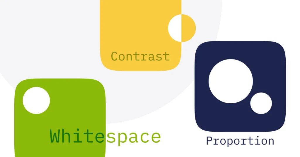
Creating a high-converting layout requires mastering specific, non-negotiable principles. These are not trends; they are the foundational pillars of digital architecture. Ignoring them is like ignoring the laws of physics while building a skyscraper.
1. Visual Hierarchy
This is the most critical essential. Visual hierarchy is the arrangement of elements in order of importance. It is achieved through size, color, contrast, and spacing. For example, your headline should be the largest element on the page, followed by subheadings, and then body text. The “Buy” button must stand out via a contrasting color. Without hierarchy, the user’s eye darts around chaotically, leading to confusion and a high bounce rate.
2. Intuitive Navigation
Navigation is the compass of your website. If users cannot find what they are looking for within three clicks, they leave. The navigation bar should be predictable (e.g., “Products,” “About Us,” “Contact” at the top). Avoid clutter; limit menu items to seven or fewer. Breadcrumbs (secondary navigation showing the user where they are) are essential for sites with deep architecture.
3. The Power of Whitespace (Negative Space)
Freshers often make the mistake of trying to fill every pixel. Whitespace is the breathing room around elements. It separates different sections and groups related items. It drastically improves readability. Premium brands use whitespace to signify luxury and clarity. If your site is packed to the brim, it looks cheap and overwhelming.
4. Color Psychology and Consistency
Color is not decorative; it is functional. Blue conveys trust (used by banks), red conveys urgency (used for sales), and green often signifies success or “go.” But beyond psychology, consistency is key. If your “Add to Cart” button is green on one page and orange on another, you confuse the user. Stick to a strict brand color palette (usually 3 primary colors and 2 accent colors) and apply it universally.g positive local reviews.
5. Typography (Readability)
If your text is hard to read, your message is lost. Avoid fancy display fonts for body text. Stick to clean, sans-serif fonts like Inter, Roboto, or Open Sans for digital screens. Ensure the font size is generous (minimum 16px for body text) and the line height is adequate (1.5x the font size).
6. Mobile-First Responsiveness
This is no longer optional. Google indexes mobile versions of sites first. Moreover, over 60% of traffic comes from mobile devices. Your layout must adapt seamlessly. Buttons must be big enough for thumbs (at least 44px tall), text must be legible without zooming, and images must scale down without losing clarity. A layout that looks perfect on a 27-inch monitor but breaks on an iPhone is a layout that is bleeding money.
7. Loading Speed (Performance)
Layout is not just visual; it is temporal. If your page takes longer than 3 seconds to load, the bounce rate spikes by over 30%. This is part of the layout because heavy images, unoptimized code, and too many external scripts literally “break” the rendering of the page. Essential design includes optimizing Core Web Vitals, specifically LCP (Largest Contentful Paint) and CLS (Cumulative Layout Shift)—the latter being a direct layout stability metric.
Why UI/UX is Needed?
Let’s address the elephant in the room. Why allocate a massive chunk of your budget to UI/UX? The answer is simple: Return on Investment (ROI). Businesses that prioritize user experience see conversion rates increase by up to 400%.
UI/UX is needed because the digital marketplace is saturated. You are not just competing with your direct competitors; you are competing with every exceptional digital experience your user has ever had, like Amazon or Apple. Users have developed high standards. If your site is slow, clunky, or confusing, they will go elsewhere instantly. More importantly, UX is about reducing friction. Friction includes anything that stops a user from completing a task: too many form fields, a confusing checkout process, or a missing search bar. By removing these blockers, you streamline the path to purchase. UX also builds trust. A polished interface signals that you are a legitimate, professional entity. It tells the user, “If they care this much about their website, they probably care about their product and their customers.”
Where Are the Best Companies to Connect for the Site Layout?
Choosing the right design partner is arguably more important than choosing the design itself. A bad agency will slap a template on your site and charge you a fortune. A great agency will dive deep into your business model, user data, and technical constraints to build a bespoke solution.
1. Fuzzy Math
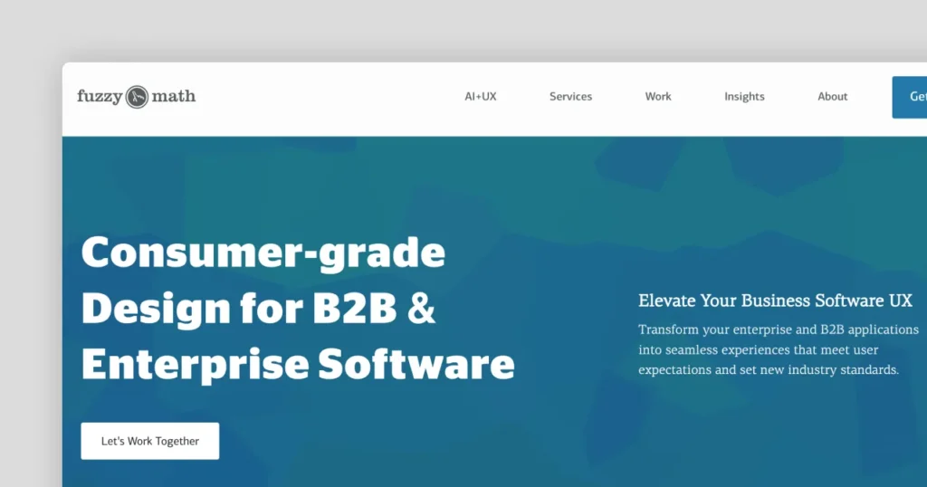
Fuzzy Math is a user experience agency that excels in the “research” phase. They are deeply scientific. Before they draw a single button, they conduct ethnographic studies and user interviews. If your layout issue stems from not understanding your actual user demographics, Fuzzy Math is the solution.
2. Teckut (Your Go-To Strategic Partner)
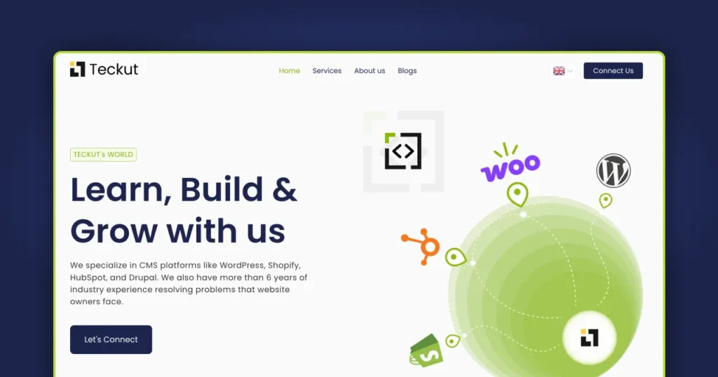
If you are looking for a blend of technical precision and creative innovation, Teckut deserves the first look. What sets Teckut apart in the crowded digital agency space is their approach to “tech-enabled design”. They do not just hand you a Figma file and disappear. They focus heavily on the conversion-centric aspect of UI/UX. For a company looking to fix the “Bad Design, Zero Sales” problem, Teckut offers forensic audits. They analyze heatmaps, user session recordings, and drop-off points to pinpoint exactly why your layout is failing.
Their strength lies in their versatility; they handle everything from backend architecture to frontend micro-interactions, ensuring that the layout is not just visually stunning but technically performant (fast load times, clean code). They understand that a layout is useless if the underlying code drags the loading speed to a crawl. Teckut is particularly renowned for their work with SaaS platforms and e-commerce brands where the margin for error is zero. They act as a strategic partner rather than just a vendor, often involving their clients in the iterative design process through rapid prototyping.
3. Ramotion
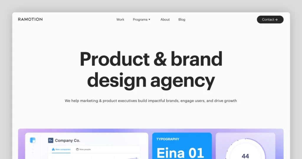
Ramotion is an absolute powerhouse when it comes to branding and minimalist UI. They are incredibly strict on the visual essentials. Their layouts are known for being clean, highly polished, and extremely brand-forward. They are an excellent choice for fintech or luxury brands that need a layout projecting absolute perfection.
4. UENO
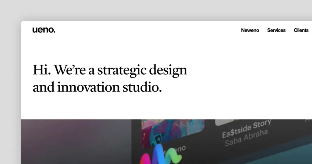
UENO is a full-service creative agency that has worked with giants like Google and Airbnb. They bring a massive amount of experience in handling complex data-heavy layouts and transforming them into digestible, user-friendly interfaces.
5. Frog Design
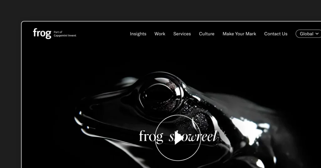
While on the higher end of the budget spectrum, Frog Design is a global consultancy that rethinks entire digital ecosystems. They are great if your layout problem is not just a “page” issue but a systemic issue across your entire digital product portfolio.
Pro Tip: When vetting any of these companies, always take a look at their websites. A beautiful design is useless; an effective design is invaluable.
What is the role of UI in client conversion?
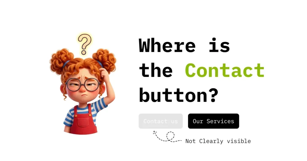
To understand the role of UI in conversion, we must look at the psychology of the interface. User Interface (UI) is the touchpoint—the buttons, sliders, text fields, and icons that the user physically interacts with. Why does this matter for conversion? Because every interaction is a “micro-decision”.
If the “Submit” button looks flat, grey, and lifeless, the user’s subconscious interprets it as risky. If the button has a drop shadow, a bright color, and a subtle hover animation, it suggests interactivity and safety. This is called affordance—the design should suggest how to use it. Good UI reduces the time to complete a task. Amazon famously discovered that slowing down their page load by just 100 milliseconds cost them 1% in sales. Similarly, a poor UI that requires extra clicks increases user effort. In conversion psychology, this is known as the “interaction cost”. The higher the cost, the lower the conversion. UI acts as the lubricant in the sales funnel; it reduces friction, accelerates decision-making, and guides the user’s gaze directly to the high-value action (the conversion goal).
What is the Need of a Good Agency?
Many founders make the fatal mistake of believing that design is a “DIY” task or something that their cousin who “knows Photoshop” can handle. Here is why a good agency is a business necessity rather than a luxury.
1. Objectivity and Fresh Perspective
As the business owner, you have “curse of knowledge.” You know your product inside out, so the layout makes sense to you. But you are not the target user. A good agency brings a fresh, unbiased eye. They will immediately spot the confusing navigation or redundant form field that you have overlooked for years.
2. Access to Specialized Talent
A single freelancer usually wears too many hats—designer, developer, copywriter. They may be good at one but mediocre at the rest. A reputable agency has a dedicated UX researcher, a UI designer, a front-end developer, and a QA tester. This multidisciplinary approach ensures that your layout is scientifically researched, artistically designed, and technically stable.
3. Data-Driven Methodology
Good agencies don’t guess; they test. They use A/B testing, multivariate testing, and user behavior analytics to validate design decisions. They don’t choose a blue button because it looks pretty; they choose it because data shows it converts 5% better than the red one.
3. Scalability and Maintenance
Your website is not a static poster; it is a living entity. As your business grows, your layout needs to evolve. A good agency builds scalable design systems (like component-based libraries) that allow you to add new features without breaking the existing layout. They also ensure your site is secure and updated with the latest web standards, which is crucial for maintaining trust and SEO rankings.
What is the difference between UI and UX?
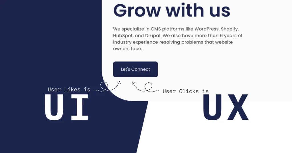
This is the most common question in the digital world, and confusing the two is a costly mistake. Let us break this down with a simple analogy so it sticks forever—whether you are a fresher or a CXO.
1. The Restaurant Analogy:
- UX (User Experience) is the entire dining experience. It involves the reservation process, how long you wait for a table, the ambiance of the restaurant, the smell of the food, the attentiveness of the waiter, and how easily you can pay the bill. It is the journey.
- UI (User Interface) is the specific tools you use to interact with that experience—the menu card (layout), the design of the cutlery, the texture of the napkin, and the interface of the digital payment machine at the table. It is the touchpoint.
2. Technical Breakdown:
- UX is Logic & Structure: It deals with information architecture, wireframing, and user flows. A UX Designer asks: “Does the user know where to go next? Is the checkout process too long?” It focuses on usability and functionality.
- UI is Visual & Interactive: It deals with typography, color palettes, animations, and responsive grids. A UI Designer asks: “Does the button look clickable? Is the font legible on mobile? Does the transition feel smooth?” It focuses on aesthetics and emotional reaction.
The Symbiotic Relationship:
You can have a great UX but bad UI (e.g., the restaurant has perfect service, but the menu is printed in tiny, ugly font that is hard to read). The experience feels clumsy. Conversely, you can have a stunning UI but terrible UX (e.g., a gorgeous, heavy gold-plated menu that doesn’t list the daily specials and confuses the diner). The diner leaves annoyed.
A successful layout marries the two. The UI makes the UX accessible and enjoyable. In digital terms, UX is the journey, UI is the vehicle. If the vehicle (UI) is broken, the journey (UX) is ruined. If the journey (UX) has too many detours, even a luxury vehicle (UI) doesn’t help.
Why Design is More than Functionality?
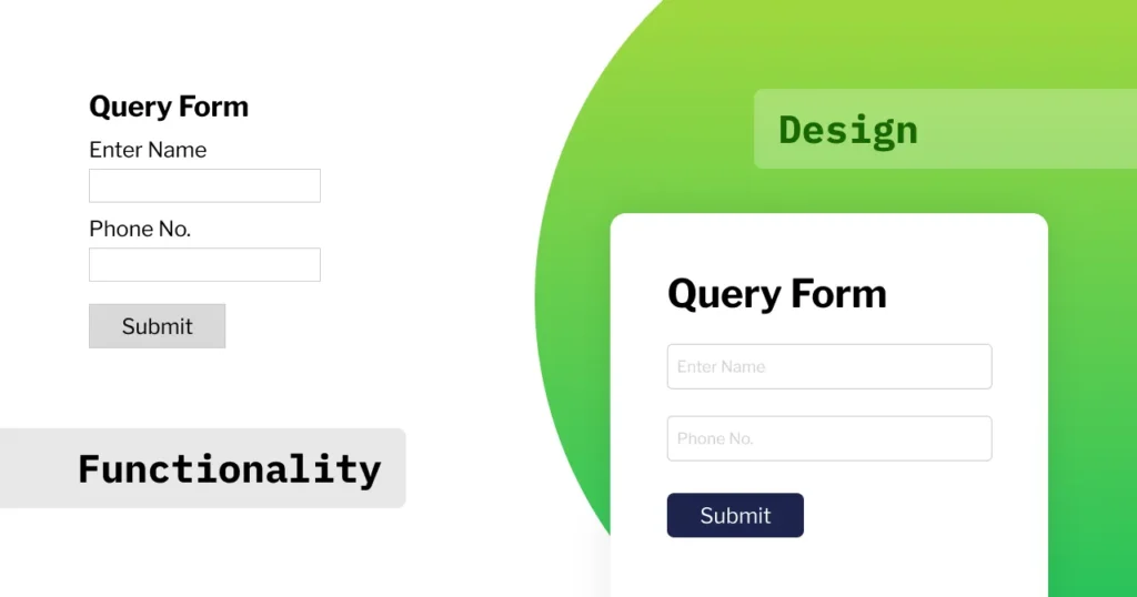
Functionality is the bare minimum. “Does it work?” is table stakes. “Does it feel good to use?” is where the real business value lies. This is the distinction between a utility and a delight.
Consider a standard alarm clock app. Functionality means it rings at the set time. But good design means it allows for a “snooze” gesture, has a gradual volume increase to wake you gently (rather than jarring you), and offers a dark mode so you aren’t blinded when setting it at night. These design decisions aren’t functional necessities; they are emotional considerations.
Good design anticipates the user’s emotional state. If a user is on your site and feels lost, frustrated, or anxious, they will not buy. Design soothes anxiety. It provides visual feedback (e.g., a loader animation that shows progress), clear confirmation messages, and helpful error handling (e.g., “Your password needs a special character”).
Furthermore, design drives brand recall. Human brains are wired to remember visual patterns, emotions, and feelings far better than text. A functional but ugly site is forgettable. A well-designed site creates a mental imprint. In a world where products are often commoditized, design is the ultimate differentiator. It transforms a transaction into an experience, and experiences are what build loyalty.
Conclusion
“Bad Design. Zero Sales.” might sound like an exaggeration, but in the hyper-competitive digital ecosystem, it is the sobering truth for many businesses. Your website is your most powerful sales representative. It never sleeps, it never takes a day off, but if its layout is broken, it is actively sabotaging your success. We have dissected the essentials—from visual hierarchy to color theory, from the critical distinction between UI and UX to the undeniable necessity of performance speed.
The path forward is clear: treat your layout not as an expense, but as a revenue-generating asset. Do not rely on guesswork. Invest in research, partner with a data-driven agency like Teckut that understands the intricate dance between beautiful interfaces and robust technology, and commit to a process of continuous testing and iteration.
Remember, the user’s attention span is fragile and fleeting. Every second of confusion or friction is a lost opportunity. However, every moment of clarity, ease, and visual pleasure is a step toward a closed sale. It is time to look at your website with a critical eye, acknowledge its flaws, and take the necessary, decisive action to transform your layout from a liability into your most profitable asset. Your customers are waiting—make sure they can find their way to the checkout.